So you want to create your online brand for your side hustle but you’re not really sure what that means.
Let me show you how to create your online brand that showcases who you are and what you do. And it doesn’t have to cost a lot to have something effective and catchy.
You’re probably completely overwhelmed with all the things that you think you need to be doing when really you just need to focus on serving your clients in the beginning. So that’s the first thing I would suggest you focus on. If you don’t have clients yet, don’t even worry about creating your brand. It’s not necessary and it’s just kind of busy work.
Because if you aren’t making money, you don’t have a business, and you don’t need to worry about branding your business if you don’t have one that’s making money.
So make sure you’re there. I can’t believe I’m saying this, but stop the video or stop reading this blog post and make sure you figure out how to get your first client. It’s so important that I’ll wait for you! ?⌚
READ: Create a 30-Day Side Hustle Plan
READ: How to Land Your First 3 Freelancing Clients
If you have started making money and now want to set up your brand and your online prisms presence, stick with me. We’re going to cover a few different things.
Table of Contents
How to Create Your Online Brand in 4 Simple Steps
#1. Choose Your Online Persona
The first thing you want to think about is what your online persona is going to be. That’s the voice that you’re choosing to speak in. This is super important if you want to attract and connect with your target audience or your ideal client or customer.
Make sure that you’re using the words that bring in the people you want to work with. But be sure that it’s authentic to you, too. I wrote about a great way to uncover your authentic voice in this post.
For me, I’m really conversational. I’m pretty laid back and those are the types of people that I want to work with, people who don’t care about pomp and circumstance. I really am just someone that is laid back, casual but likes to take action.
I’m very much focused on making sure that I use those types of words and language in anything that I write or deliver and communicate that appropriately.
So figure out the words that you want to use to communicate and use them to hit home what it is that you stand for and who you can help the most. That way, your ideal clients and customers can identify with you and will want to reach out to work with you.
That is the first part that you need to have when it comes to creating your online brand. And the second, third, and fourth parts of this are all the fun things.?
The things that most people think about when it comes to their brands are:
- Colors
- Fonts
- Layout
Which is what we’re going to cover now!
#2. Colors
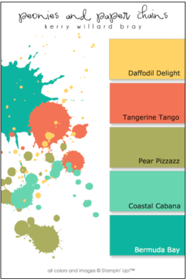
 To create your online brand, you’re going to pick out colors that connect your audience with the voice that you’re trying to portray. So what you are trying to convey. Is it professional? Is it slick and modern? Is it down-home country? Your goal is only to have four, five maximum colors that represent your brand.
You want to make sure that you have a color for your headings, a color for subheadings, and then if you want to highlight clicks for your buttons, or your links, whatever that is that you’ve identified those colors as being.
Then you’ll use probably an array of colors within that color spectrum. So figure out what that looks like. This amazing post from Canva.com talks about how you can choose colorways and start your ideas around what those colors are going to look like together. Because one of the first things that people are going to see is your brand colors.
Make sure you choose colors that align with you but also attract the people that you want to be working with. There is an entire field dedicated to the psychology of color, so it’s not something to be overlooked in your online business branding.
#3. Fonts
 Another layer of online branding is font choice. Now you might think that this doesn’t matter but it does.
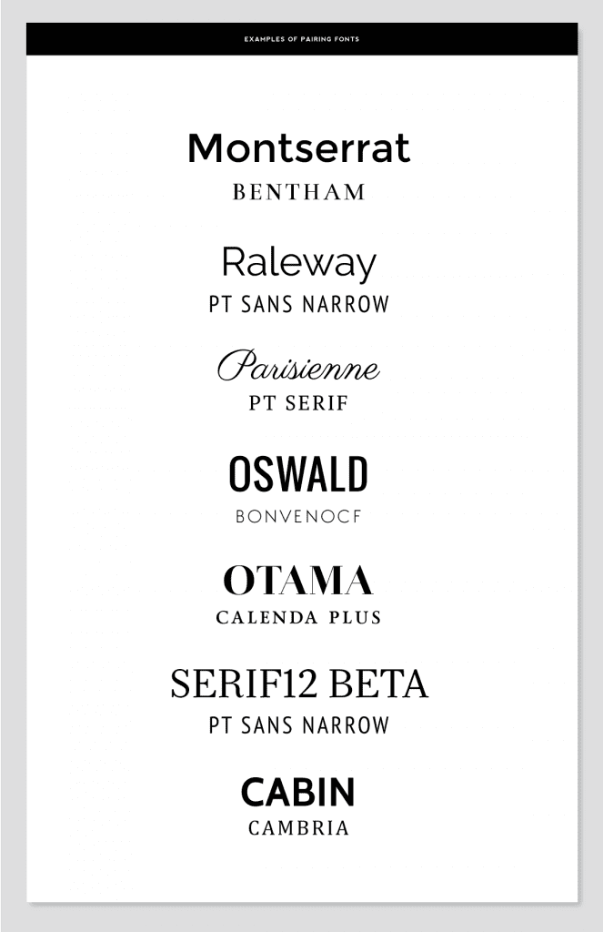
When you start creating social media images and you start creating lead magnets, you need consistency. That’s how people recognize you because you’ve got consistency in colors. You’ve got consistency in fonts. So again, I’m going to link to another post from Canva that talks about all the different fonts and how you go about finding the right pairings.
I have three fonts, well actually two fonts. But I add a third when it comes to social media. So my headings are always Oswald. My body font is always Montserrat. And then whenever I’m posting social media images or anything like that I will also use a script font called Playlist Script. Just to give a bit of variation.
So figure out what that looks like for you. There are so many font combinations that you’ll want to make sure you get it right.
Here’s a tip:
Make sure that you’re either using fonts that are in the same family or completely contrasting. For example, I said I use Montserrat and Montserrat Thin. One is just a finer version of the other and that works well.
You also want to mix it up a little bit for visual interest and have a Sans Serif and a Serif font. Sans Serif fonts—these are fonts that do not have the little serifs or strokes on the ends of letters—work really well for headings and Serif fonts work really week for body text.
Again, the Canva post is going to help you figure out what those look like. And obviously, they need to be cohesive with your overall branding and something that you’re going to use across everything that you put out.
Lead magnets, emails, and all those types of things need to have the same consistency in terms of font and colors. That’s how people identify you and your online brand instantly.
#4. Layout
On your business website:
And then the fourth part of branding is a little idiosyncrasy that people tend to forget, but it’s the layout. Making sure, again from a consistency perspective, that you’re doing things that look the same.
When people land on your website, if you’ve got landing pages for opt-ins, all those things need to follow the same structure.
This means that your blog posts should follow a similar layout too. You want to keep things looking the same so that your target audience recognizes your brand.
Just take a look around the Hustle & Groove site. You’ll see the consistency in layout on every page you click on.
For business social media:
The same goes for social media. Your social media posts should follow some type of consistency.
You can mix it up but you need to make sure that you’re using the same things over and over again because we connect with what we remember and what we recognize.
So if you keep changing up your fonts and you keep changing up the colors and you keep changing up your layouts, people are not going to make an immediate connection with you and your business. They’re not immediately going to recognize that it’s you and that’s exactly what you need when you’re creating your own brand. Consistency is key for instant recognizability.
Your Action Step
So your immediate action step is to review the four points that I talked about above and then start figuring out what that looks like for you if you’re making money in your side hustle.
If you’re not yet earning in your business, save this and come back to it when you are. Then you can come in and do all of this fun stuff!
And remember, there’s a strong psychological component to branding that takes place on the subconscious level. Use it to your business advantage!

