Are you looking to increase email subscribers but feel like you’ve got no idea where to start?
I feel ya. There are so many things you can be doing to increase email subscribers, but sometimes (most times?!) it’s better to go with the things that are simple but provide a good return on investment.
And making small website tweaks is one of those simple things you can be doing right now to help increase people joining your email list.
In this blog post, I’m going to provide you with five different website tweaks you can make TODAY that will immediately increase email subscribers.
Table of Contents
But, before you jump straight into this, I’m going to assume you’ve got the following all set up:
[bullet_block style=”size-16″ small_icon=”12.png” width=”” alignment=”center”]
- An email service provider (I use ConvertKit)
- An opt-in form or opt-in page set up
- A lead magnet (you can have multiple)
- Your welcome email series set up inside your email service provider
[/bullet_block]
If you’ve nodded yes to the above, then you’re set to go. If you haven’t, then you need to take a moment to get those things in place, otherwise, nothing I mention below is going to make a whole lotta sense… yet.
Related articles to check out:
5 Small Website Tweaks to Increase Email Subscribers
#1: Content Upgrades
This small website tweak is pretty easy to implement. Simply follow the steps below and in no time, you’ll notice an increase in email subscribers!
#1. Start by looking at your top 10-20 blog posts
These are the ones getting the most views on Google (you’ll need to check your Google Analytics for this info).
#2. Add more value
Once you’ve identified these popular blog posts, think about ways you can add more value to them by way of a ‘content upgrade’.
This could be something like a checklist, a cheat sheet, a video tutorial etc.
#3. Add CTA buttons
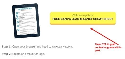
Once you’ve created the content upgrade, add a call to action (CTA) button or inline opt-in form to your blog post.
You should look to have the CTA mentioned within your blog post about 2-3 times, but no more than this. Make sure one of the CTA’s is at the bottom of your post too, for maximum exposure.
You can see this in action on the image below. To view the live post that this came from, click here.
#2: Popup Based on Intent
Now, you might be feeling a little icky right now at the mention of a popup… and that’s ok. If this doesn’t feel right for you and your website, skip ahead to the next tweak.
And even though you might find them annoying, they do convert. The numbers don’t lie on this. They work, really well.
The Sumome plugin provides a great popup option called List Builder. What I love about this popup is that you can choose when it “pops up”, so it’s as least annoying as possible to your visitors.
LeadPages also provides this as part of their paid model, Optinmonster too.
If you’re using Mailchimp or ConvertKit, both of these email providers also give you this as an option, although you may need to tinker in the HTML to do this.
Watch the quick tutorial video below on how to add a popup using ConvertKit.
[video_player type=”youtube” width=”853″ height=”480″ align=”center” margin_top=”0″ margin_bottom=”20″]aHR0cHM6Ly95b3V0dS5iZS9HRlJucDdQYXhhMA==[/video_player]
#3: Add a Smart Bar CTA
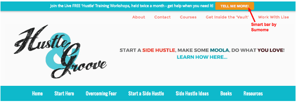
This is probably one of the easiest website tweaks you can make to increase email subscribers. It’s fast to implement too.
When building your subscriber list, your aim is to have multiple ways for people to join your list. A smart bar is a ‘smart’ way to do this 🙂
Again, the Sumome plugin has you covered, or you could use the Hello Bar as another option.
Make your call to action different than what you’re offering in your sidebar or top menu. This is perfect if you have more than one lead magnet, as you can highlight one in your smart bar and one in your popup!
If you only have one lead magnet, then lead them to the opt-in page or if you have a really popular blog post (or guest blog post) send them to that instead.
You control the smart bar, so think about what you want to promote each week and change it accordingly. (Hint: If you’ve got a marketing plan/calendar, see what’s on it that you could be promoting in the smart bar!)
Personally, I use it to promote my free training workshops or a lead magnet, depending on what’s going on inside my marketing calendar.
#4: Sticky Sidebar
Have you ever noticed that when you visit a blog, as you’re scrolling, the sidebar seems to stay with you? My super technical term for that is a ‘sticky’ sidebar and it’s extremely effective if you want to highlight just one or two items.
I’ve been using this on my website for a while now and I’m super impressed by the conversion rates. Conversions have increased by 20% from my sidebar, all because I implemented the ‘sticky’ strategy.
To make a ‘sticky’ sidebar, you need a special plugin. It’s called “Q2W3 Fixed Widget” — it’s only available for WordPress and it will change your life.
You can see it in action here on the blog — I’m promoting one of my main lead magnets and my course, which you can see an example of by scrolling down to the bottom of this post and seeing what happens to the side bar…
They key to this plugin working effectively is to have no more than 3 sticky widgets in that sidebar. Any more than that and it’s too much for your visitors and they won’t take any action.
#5: Add Opt-in to Contact Page/About Page
This is a simple tweak to make to your site to increase email subscribers. It shouldn’t take you more than 5 minutes to implement if you’ve got the right tools available to you.
You may as well make the most of the website real estate you have, right?
Use your email service provider plugin add your opt-in box to your contact page and about page. You can also do this with plugins like Optinmonster or LeadPages.
If you’ve got a resource library, this is a great opt-in to display on these two pages. Otherwise, simply choose the lead magnet that makes the most sense, or promote your webinars or Twitter chats.
Whatever you want to get eyeballs on, add your opt-in to these pages.
If you’re not sure if people are clicking on these pages, enable the “heat map” on the Sumome plugin, let it run for a few days and then check to see if people are clicking on those pages.
Don’t forget to enable the heat map on those two pages as well, they aren’t enabled by default, you have to do this manually.
Watch this quick tutorial video on how to enable the heat map option in Sumome.
[video_player type=”youtube” width=”853″ height=”480″ align=”center” margin_top=”0″ margin_bottom=”20″]aHR0cHM6Ly95b3V0dS5iZS9tWVIyM1RueDZnMA==[/video_player]
Now It’s Your Turn!
Now all that’s left to do is implement one or more of these tweaks on your own website and begin converting those visitors into subscribers!
[optin_box style=”12″ alignment=”center” email_field=”email” email_default=”Enter your email address” integration_type=”convertkit” double_optin=”Y” thank_you_page=”https://hustleandgroove.com/thanksforsubscribing” list=”42312″ name_field=”name” name_default=”Enter your first name” name_required=”N” opm_packages=””][optin_box_field name=”headline”][/optin_box_field][optin_box_field name=”paragraph”]PHA+PGEgaHJlZj0iaHR0cDovL3d3dy5odXN0bGVhbmRncm9vdmUuY29tL3dwLWNvbnRlbnQvdXBsb2Fkcy8yMDE2LzA0L0pPSU4tVEhFLUhHLVNFQ1JFVC1WQVVMVC5qcGciPjxpbWcgY2xhc3M9ImFsaWduY2VudGVyIHNpemUtZnVsbCB3cC1pbWFnZS0zNDYzIiBzcmM9Imh0dHA6Ly93d3cuaHVzdGxlYW5kZ3Jvb3ZlLmNvbS93cC1jb250ZW50L3VwbG9hZHMvMjAxNi8wNC9KT0lOLVRIRS1IRy1TRUNSRVQtVkFVTFQuanBnIiBhbHQ9IkpvaW4gdGhlIEgmYW1wO0cgU2VjcmV0IFZhdWx0IHRvZGF5ISIgd2lkdGg9IjcwMCIgaGVpZ2h0PSIzMDAiLz48L2E+PC9wPgo=[/optin_box_field][optin_box_field name=”privacy”]We value your privacy and would never spam you — that’s just gross. You can unsubscribe at anytime.[/optin_box_field][optin_box_field name=”top_color”]undefined[/optin_box_field][optin_box_button type=”1″ text=”Access Now” text_size=”20″ text_color=”#ffffff” text_font=”Montserrat;google” text_bold=”Y” text_letter_spacing=”0″ text_shadow_panel=”Y” text_shadow_vertical=”1″ text_shadow_horizontal=”0″ text_shadow_color=”#0eb9cb” text_shadow_blur=”0″ styling_width=”20″ styling_height=”17″ styling_border_color=”#027381″ styling_border_size=”1″ styling_border_radius=”6″ styling_border_opacity=”100″ styling_shine=”Y” styling_gradient_start_color=”#0eb9cb” styling_gradient_end_color=”#027381″ drop_shadow_panel=”Y” drop_shadow_vertical=”1″ drop_shadow_horizontal=”0″ drop_shadow_blur=”1″ drop_shadow_spread=”0″ drop_shadow_color=”#027381″ drop_shadow_opacity=”50″ inset_shadow_panel=”Y” inset_shadow_vertical=”0″ inset_shadow_horizontal=”0″ inset_shadow_blur=”0″ inset_shadow_spread=”1″ inset_shadow_color=”#0eb9cb” inset_shadow_opacity=”50″ location=”optin_box_style_12″ button_below=”Y”]Access Now[/optin_box_button] [/optin_box]


2 replies to "Small Website Tweaks You Can Make to Increase Email Subscribers"
I’ve been practicing everything you mentioned except convertkit which I am switching to now. I was an AWeber fan for years but now it is time to upgrade.
Great post.
That’s great to hear Webly. ConvertKit will definitely make life a LOT easier for you!