An honest ConvertKit Review…
As a creative entrepreneur, one of the main ways I stay in touch with you, my lovely readers, is through email. And until 2016, ConvertKit wasn’t my email service provider… (I know, shock horror!)
A large part of what I do on a daily basis involves a heavy amount of email marketing. And to make sure that I’m always spending my time wisely, I only like to work with the tools that work the best for my business.
I’ve been running Hustle & Groove for over 8 years now, and I have had email marketing as part of this site in one form or another, during that time.
As my business and readership began to grow, I began to need different things from my email service provider (Mailchimp) that frankly, they just didn’t provide.
Was it time to switch?
I’m sure you’re already familiar with other posts about why people switched from Mailchimp to ConvertKit.
And I wanted to provide my views as well because you guys trust what I have to say and I’ll give both the positives and negatives as I see them.
Table of Contents
Here’s what you’re gonna learn in this blog post:
[bullet_block style=”size-16″ small_icon=”12.png” width=”” alignment=”center”]
- Problems I faced with Mailchimp
- Why I switched to ConvertKit
- Why I love ConvertKit (and why you should check it out too!)
- My favourite ConvertKit Features
- Why ConvertKit might work for your business
[/bullet_block]
As a side note, all links to ConvertKit you see are my affiliate link. You don’t have to use that, but I’d love it if you did, as it helps keeps the lights on here at H&G Headquarters, aka, my home office 🙂
The Problem With Mailchimp
Before I dive into the problems I found with Mailchimp, I want to say how much I LOVED Mailchimp until ConvertKit landed in my lap.
Up until March 2016, I had been (mostly) happy with my time with Mailchimp, even with the problems I’m going to outline below.
Here’s what was great about Mailchimp at the time (2015):
[bullet_block large_icon=”31.png” width=”” alignment=”center”]
- You can get started with email marketing for free*
- Their user-interface is awesome
- Their pricing is pretty competitive and budget-friendly
- Almost all major website platforms integrate with Mailchimp
- Their training is extensive
- They have an awesome monkey who high fives you and interacts with you
[/bullet_block]
*The free option is up to 2000 subscribers and doesn’t include any of the premium features like autoresponders. You can schedule broadcast emails only.
So that’s the good bits.
Segmenting? Where You At?
The problem that I began to face while using Mailchimp is that I struggled to segment my list easily.
If you’re wondering what that means:
I wanted to be able to put subscribers into groups based on the actions they took, whether it was grabbing a content upgrade, joining the mailing list from a blog post or buying a product.
Unfortunately, with Mailchimp, the only way I could do this was to create a new list. This might not sound like a major deal but when you consider how Mailchimp charges you, you’ll understand why this is frustrating.
Mailchimp charges you based on subscriber count. Again, this doesn’t seem like such a big deal, until you understand what that means…
Consider this scenario:
[feature_box_creator style=”1″ width=”700″ top_margin=”5″ bottom_margin=”5″ top_padding=”5″ right_padding=”” bottom_padding=”5″ left_padding=”” alignment=”center” bg_color=”#75d7e1″ bg_color_end=”#0eb9cb” border_color=”” border_weight=”” border_radius=”” border_style=”” font_size=”14″ font_font=”Montserrat” font_shadow=”none”]
Jane lands on the H&G Website and joins the H&G Vault. Awesome. She gets an email confirming her subscription and immediate access to The Vault.
Over the next few days, Jane enters the H&G welcome email series which links her back to other blog posts on the site. She grabs a content upgrade for creating lead magnets and she also decides to join the Side Hustle 7-Day Challenge.
[/feature_box_creator]
In Mailchimp, the content upgrade and challenge are separate lists. Jane is SUBSCRIBED to each list individually.
She uses the same email address for each one.
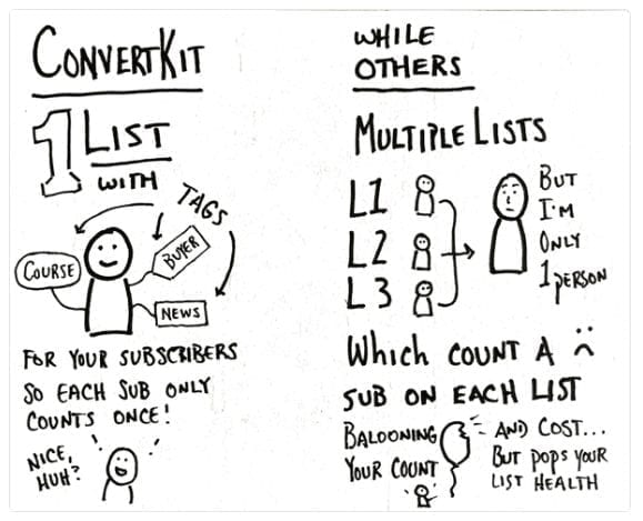
Now Jane is on the H&G Vault List, the Content Upgrade List, and the Challenge List. Mailchimp counts Jane three times because she has SUBSCRIBED to three different lists.
By now, you should be looking like this:
Once I realised and understood this, I was more than a little annoyed.
Automation. What’s That?
The other problem that I found with Mailchimp is that the automation side of things wasn’t easy to do.
Taking Jane’s scenario above, I wanted a subscriber that joined The Vault, who also joined the Side Hustle 7-Day Challenge, to get a different email series.
On Mailchimp, this can’t be done easily.
While setting up the autoresponders is easy now, when I first used Mailchimp, you had to set up your autoresponder emails individually and link them together.
When they switched to a more intuitive-based setup, I had to delete all my autoresponders and set them up again. Super annoying.
Where Are My Forms?
The form setup isn’t intuitive. There is a lot of drilling down to find what you need and making changes to the form layout requires a bit of digging around too.
Some of the areas that you need to make changes are strangely labeled, like if you want to change the CTA button (Subscribe) then you have to do that under “Translate It” — not where you’d expect to make that change, right?
Subscriber email forms…
The other issue I found was that to set up the subscriber confirmation emails, I had to drill down a lot to figure out what the heck I was meant to do, and there are a lot of options with no real explanation on what to do.
And setting these up is under your form setup…I know, not where you’d expect to see them, right?
If I wanted an email to send out immediately after someone confirmed their email, I had to set that up in the “Welcome Email” option inside setting up the email form, not as an autoresponder. #Confusing.
This last part was eased a little when I switched to OptimizePress as my blog theme and used their forms instead, but I still had to set up that welcome email anyway.
So while my love for Mailchimp had been long, it had started to wane. And when I decided to rebrand this site to Hustle & Groove, it felt like the right time to switch to another email service provider.
But which one to choose?
ConvertKit Review: Why I Switched to CK
Switching to ConvertKit wasn’t smooth sailing for me. I had taken a look at ConvertKit in early 2015 and almost died when I saw the price… and I quickly unsubscribed.
This time around, I considered ConvertKit as a contender for my email service provider after a good friend of mine, Sean Ogle from Location Rebel, made the switch.
Sean had been using Aweber for about 5 years and had loved it like I loved Mailchimp, but he started to have issues with Aweber like I was having with Mailchimp.
So I figured if Sean was taking a gamble on ConvertKit, I might too.
Here’s some of the reasons why I felt ConvertKit would be a good fit for me:
Switching email service providers is no easy feat.
There are a lot of things to consider, including:
It took me about 6 weeks to decide on switching to ConvertKit because of these factors.
What helped make the decision a positive one was that ConvertKit provided me with a migration map on what I needed to do and a spreadsheet to track everything.
This helped me to see what I needed to do and when, while also seeing the time factor involved. They have since provided migration help for Mailchimp, Aweber, and Infusionsoft users, which makes the process even easier.
But I won’t lie. Migrating from one email service provider to another sucks. It’s time-intensive and there will still be things you miss.
Which is why I took so long to decide. I wanted to make sure that the email service provider I went with was one that I was going to grow with. Because let me tell you, I did not want to be repeating this process in another 3 years, with an email list a lot bigger!
So a word of caution if you’re looking to switch email service providers. Make sure that whoever you choose, that they are going to suit you for the long-term.
When your list size is under 3,000, it’s relatively easy to move providers. But once it gets larger than that, well, you’re gonna look like this at the end of the process…
My Favourite ConvertKit Features
The features inside ConvertKit are pretty cool.
But the features that I love and use the most are:
#1: Tagging
This has changed the way my email system works.
You might be wondering what tagging is, so here’s a brief image that I stole from their website that explains what it is.
ConvertKit goes into great detail on how to segment and use tagging in this help article here. Once I read this and understood it, I got started on tagging like a ninja!
I create tags daily and you can have as many tags as you want. I use a spreadsheet to keep track of them all, which you can grab below.
#2: Email Sequence
I love how ConvertKit provides me with the bones of an automation to get started with.
This helps when writing email sequences. And having an optimal delivery schedule already mapped out for me makes setting these up a complete breeze.
Nathan Barry, the brains behind ConvertKit, wrote a great blog post about best practices around email sequences and why you shouldn’t be sending your new blog posts out as a broadcast.
After reading this post, I changed the way I sent out my ‘newsletter’ so that new subscribers were getting access to all my awesome content instead of having to dig through archives to find it.
Brilliant.
#3: Automation
As soon as I discovered the automation rules inside ConvertKit, I was hooked. Plus the visual funnel builder is ah-maz-ing!
I love the ability to tell CK to do this action when a subscriber clicks this link, or to do this action if a subscriber buys a product.
There are so many things you can do with the automation rules that it will blow your mind.
I got started following the automation blueprint that CK provides and from there, the sky is the limit with what you can do.
You can integrate many platforms that allow you to expand your automation, plus with the visual funnel builder, you can create sales funnels that work for you while you sleep.
#Love!
#4: Forms
Now, there’s only one thing that I didn’t like when I first got ConvertKit and that was the forms area. It took me a while to get my head around using this because I was looking for ‘lists’ having come from Mailchimp.
How the forms area works inside CK is kinda how the lists work in Mailchimp. You create a form for every opt-in or lead magnet you have and then they connect to an email sequence.
But the beauty of forms inside CK is that you don’t have to connect them to an email sequence if you want because you can auto-magically deliver your freebie from within the confirmation email.
This is something that has made a huge difference in the number of content upgrades I provide. Because it means I don’t have to go around creating email sequences just to deliver a content upgrade!
Why I Love ConvertKit
Aside from the fact that ConvertKit uses one of my favourite colours in their branding, there are many reasons why I love ConvertKit, aside from all the features I’ve mentioned above.
There are so many other reasons, but I’m pretty sure you get the drift.
If you’re considering an email service provider or switching to one, ConvertKit should be top of your list to review.
Why ConvertKit Might Work For Your Business
To be honest, you already know why ConvertKit might be a good option for your business by now.
But you might also be wondering if there are any cons?
In my opinion, there are a couple of things that might cause you not to use ConvertKit. And it’s nothing against ConvertKit, it’s about where you are at in your business…
#1: Pricing
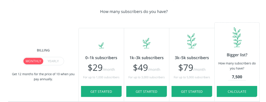
Yep. The pricing might seem pretty steep when you compare it with Mailchimp and Aweber at the smaller list level. But you can try ConvertKit out with their FREE version too!
If you want to simply dive straight in and start using ConvertKit, then their paid version gives you EVERYTHING you need to run your creative business.
So if you’re just getting started and budget is an issue (the paid CK starts at $29 USD per month for up to 1,000 subscribers ), then opt for the free version first. This will give you access to creating your own landing page and capturing subscribers.
Just consider what you’re getting for the price. Personally, I wish that I could have started with CK, it would have made life a lot easier and I would have been able to grow my subscriber base faster.
#2: You don’t have anything to sell
If you aren’t clear yet on where your blog or side hustle is going and how you’re going to monetise it, then making an investment in CK might not be the right option for you. Yet.
If you do plan to sell anything in the future, or you’re going to offer services, then CK is a good option particularly when you can get started for free.
The decision to choose ConvertKit as your email service provider is up to you. It’s your business. Your decision.
But if you want my opinion, which comes from having ‘been there, done that’ I would opt for ConvertKit as soon as I could. Life is a lot easier when you’ve got the right systems in place from the get-go…


13 replies to "Is ConvertKit Right for Your Blog or Biz?"
Love it Lise! I’ve thought a lot about ConvertKit and I really appreciate your honesty. I’m with MailChimp and need to make a little more money before I can switch but hopefully it will be soon!
You’re welcome Cheryl! Mailchimp is awesome until it’s not working for you – now you know what to move to!
[…] ConvertKit helps you do this. […]
[…] You can make Mailchimp work, but it will require a bit of tweaking (actually a lot of tweaking) to make it work like ConvertKit does, so why waste your time when you can work smarter with ConvertKit? […]
[…] ConvertKit – A Review […]
[…] part of the process will depend on the email service provider you’re using. As I use ConvertKit, it’s easy for me to segment my subscribers based on the actions they take or the forms they […]
[…] switching from Mailchimp to ConvertKit back in April 2016, I haven’t looked back. ConvertKit has allowed me to set up so many […]
[…] you’re using ConvertKit or Active Campaign, congratulations, you’re in luck, as both of these providers do this for […]
[…] Is ConvertKit Right for Your Blog or Biz? […]
[…] ConvertKit. It suits my business model and treats subscribers as individuals who can belong to multiple lists called ‘tags’ — I love this concept and it will make the whole process a lot easier going forward as I promote more books and courses. […]
[…] There are other parts to your bot that you might want to look into, such as creating broadcasts and sequences, which are very similar to your email sequences you’ve got set up in your email platform, like ConvertKit. […]
[…] Read: Is ConvertKit Right For You? […]
[…] I first got started with ConvertKit, one of the things I loved the most was the power of their email automation rules. It was also the […]